Class continues on. More assignments asked for, more completed.
First up: Take an architectural elevation.
What's that?
Oh, well, it's this thing where you take a picture of a building flat on and make it as dull as possible.
Ah, like this?
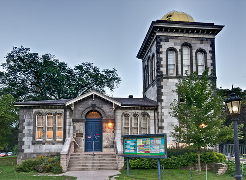
Not boring enough, but pretty good. Sky is wrong.
Well, I think it's better than the blown-out white it was before. But yah, the blending is amateur hour.
Next up: Make me an ad! You have 1.8 seconds to sell me something!
Okay, how about beer?
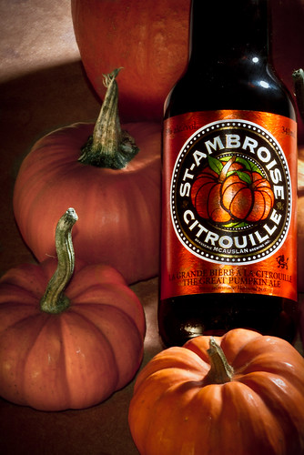
Ew, they make pumpkin beer?
It worked! I rule the school!
Finally: Take some urban street photography.
What's that?
Oh, well, it's this thing where you take a picture that is structured and is from the street. Here are some disparate examples with no obvious commonalities.
Uh... thanks. I'm not sure about any of my pictures because I'm not clear on what you want, but this one kind of reminds me of one of the examples, only much more modern and colourful.
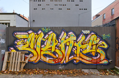
That's exactly what I'm looking for! Here's some small nebulous critique about composition that could maybe still be okay.
Really? That's it? Sweet. Maybe I can trip into a pot of gold cushioned by lingerie models next...
Huh? No picture.... damn.
Monday, October 31, 2011
Classwork
Posted by
Astin
at
11:17 PM
0
comments
![]()
Labels: Not Poker, photography
Wednesday, October 19, 2011
More Picture Time
A couple more. First, the final choice in my craps w/ RPG dice thing:
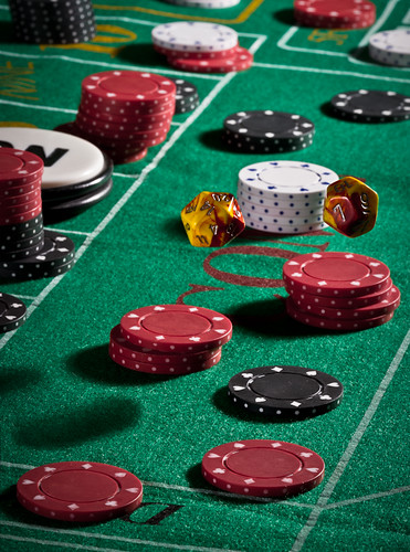
Not perfect. Shadows for the dice are too far from a visual standpoint, even if they are where they're supposed to be. Also, the comment was made that the dice look like they're suspended on the chipstack. There are some minor compositional changes I could make there, but overall I'm happy.
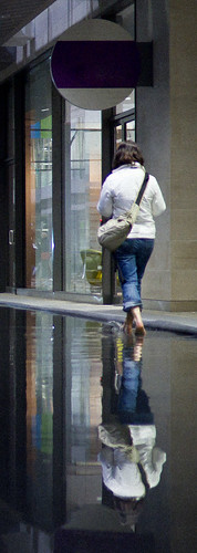
Next up, a shot from Nuit Blanche. I have a few of these to work through, which means they'll probably never get done. Especially since I have a Zombie Walk to get shots of this weekend. Maybe. If I wake up in time and care.
Posted by
Astin
at
4:06 PM
0
comments
![]()
Labels: Not Poker, photography