"Your next assignment is a triptych of 3-5 pictures."
Wouldn't that be a triptych, quadtych, or quintych? Whatever.
"It has to tell a story, not necessarily narrative though."
"No problemo boss."
So off I wander to my least favourite renovation in my fair city. The Royal Ontario Museum. The Daniel Libeskind-designed Michael Lee-Chin "Crystal" is a monstrosity that was slammed into a rather nice, if dull, classic museum. I'm not against radical change, I am against ugly radical change. Also, it's nothing like it was originally proposed. It was supposed to be mostly clear glass, which is idiotic for a museum. But then, whoa, that didn't work at all for any number of reasons someone who knows what a building is could point out and it became a mess of aluminum, and an eyesore. Of course, ol' Daniel then used the same design a few times since. Just look the City Center Mall in Vegas for the ROM's twin. /rant
Still, it makes for interesting photos. Also, from the right angle it resembles the Jawa transport crawler from Star Wars. Hence the occasionally light sabre battles that take place in front.
The idea behind the series is to show the transition from what was to what is.

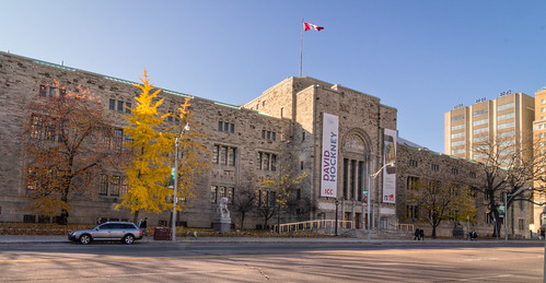
The largely unadulterated Queen's Park side.

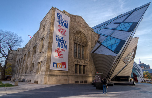
Coming around the corner onto Bloor, we see how elegantly the metal iceberg crashed into the nice old museum.

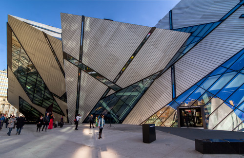
Yup, same building as the first one. You should see the all-white interior that is largely unusable for display space due to the angled walls.

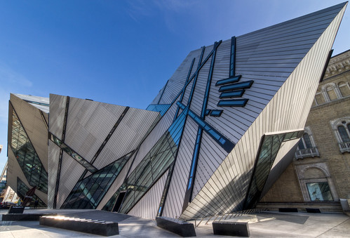
Oops! Someone left some of the old building sticking out over here.
I've actually gotten somewhat used to this building now. But I still don't like it. Even more so after it was re-made elsewhere, so it's not even uniquely ugly.
Thursday, November 17, 2011
A Triptych in Four Parts
Posted by
Astin
at
10:28 AM
![]()
Labels: Not Poker, photography
Subscribe to:
Post Comments (Atom)
No comments:
Post a Comment